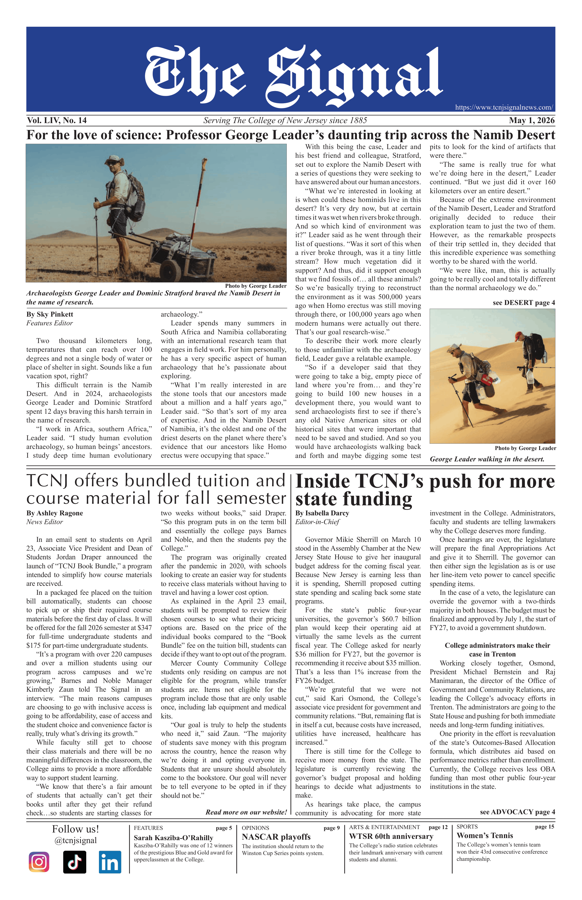
When I first saw the new logo, I read it as "TNJC." I doubt that I am the only person who read it that way.
If I did not already know it was supposed to read as "TCNJ," I would be unsure as to what order the letters should read. A logo should create a clear sense of the organization it represents, not create confusion.
I am writing to express my concern with the new graphic identity for the College. My opinions are based on my four years in the graphic design program here.
The Graphic Style Guide states that "leaving the shield open on the left side gives the design a fresh, contemporary feel." While contemporary design does often incorporate open areas, simply leaving areas open for the sake of "that is what is current in design" does not make it good design.
The e-mail sent to the college community announcing the new identity stated that "the implementation of the new graphic identity will not put a financial strain on the College during such a difficult budget time."
I find that statement ironic because the new logo's frail design reflects an organization that is falling apart, not a bold organization rooted in high standards and pushing for excellence in the future.
The e-mail to the campus community and the letter from President Gitenstein discuss how the design was "based on research that involved interviews with a wide range of College constituencies."
Were any graphic design professors consulted for this project? I would think they would be the first contacted, considering they should have the best sense of design among all of the other faculty members at the college. If they do not have the best design sense, then why are they teaching us?
However, based on what I have learned in my classes, I cannot imagine any of my professors approving the new logo's design.
I wonder if presenting the project to the art students was ever discussed. There are 27 talented graphic designers graduating this May (all of which have taken the Corporate Identity class), and a good number of graphic designers set to graduate in the next few years.
I am sure all of us would have loved to participate in a competition to design the new graphic identity for the College. We would have done so either for free, or if we were lucky enough to be paid, the payment could have been much less than what the college paid for the "professional" design job.
Being able to state on my resume that I designed the new logo would be enough payment for me. If my design did not win, designing and presenting an entire graphic identity would be a valuable experience in itself.
Even if there were no competition, at least some input from graphic design students would have been helpful to the logo creation, especially since the College wants (I assume) to attract talented students to the graphic design program, and a well-designed logo can help that cause.
Over one thousand invitations for the Spring 2003 Portfolio Review were recently printed and mailed bearing the new logo. The majority of those invitations are sent to the College's Graphic Design alumni.
As students, we hope that the alumni will be impressed with our mailer design enough to come to the portfolio review and assist us with finding jobs (hopefully by hiring us, or at least referring us somewhere).
Since many alumni will be seeing this new logo for the first time on the invitations, I hope they do not mistake the new logo as our creation and judge our design skills based on the logo.
If an art director makes that assumption, I fear he or she will not attend the Portfolio Review.
My final concern regarding the logo is that I hope it does not appear on my diploma. I plan to work very hard to become a successful designer in the future, and I would like to be able to display my diploma with pride in my office when I become an art director.
However, if the new logo appears on my diploma, I would be embarrassed to have it displayed in my office.
An art director's office should be adorned with excellent design pieces, and a diploma with a poorly designed logo would create a distraction on the wall.
This all may seem a bit harsh, but it is not easy for me to accept that that the College has paid an out-of-state company thousands of dollars for an obviously poorly designed logo while I have yet to secure a graphic design job for after graduation.