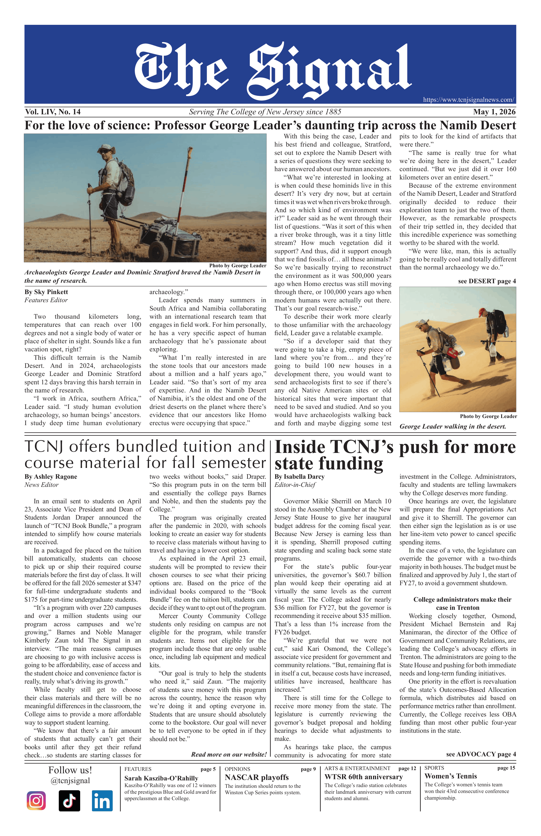
In today's society, there is a great emphasis on symbols and what they stand for. Like the rest of my fine fellow College students, I received an e-mail from the College (accurately marked as possible spam) that contained a link to our new "graphic identity." (What's wrong with logo?)
No amount of briefing could have prepared me for what I saw. As the Web site loaded on my computer, the monitor revealed one of the ugliest things I've ever seen. Seriously.
It was almost as bad as some of the dresses I saw on the Oscars.
Some would ask what's wrong with the new logo . I mean, "graphic identity." (So sorry.)
Well, for one thing, it's hideous. My eyes still hurt. Second, it bears an almost striking resemblance to the logos of Princeton and U Penn. I can't stress this enough: we're not an Ivy League school. And why should we want to be? I think what we have here is better.
Besides, if this were an Ivy League school, we'd be paying a lot more to be here, have freakishly large, black squirrels on campus and people wouldn't give us strange looks when we name the college we attend.
I can't tell you how many times I've heard "The College of New Jersey? What's that?" It's embarrassing. Furthermore, I thought that individuality and distinctive character were important at the College.
Why, then, are we trying to mimic other schools?
And what about budget cuts? Those responsible for this monstrosity must have been paid. I know, I know: "The funds were previously allocated for this purpose."
But what about allocating the funds for some equipment for the Communication Studies Department? Or for student organizations? What about using this money to serve the student body?
I know the College's image is important for attracting potential students and generating revenue, which explains why we're exiled from Eickhoff to T/W every Spring Day.
However, I happen to think that the image the College conveys to its current students is just as important.
I also think that the College has taken too much of a liking to change. It started with renaming the College, then Community Commons was renamed and now the logo has been changed
I know it's only human to resist change and a little change is a good thing, but, perhaps, there's been too much change around here.
This may be the disillusioned junior in me, but over the past three years, the College has morphed into something nearly unrecognizable and I dislike it.
The old Green Hall clock tower represented something to the College community and me. To me, it represented possibilities as limitless as the collective brilliance of the student body.
It represented hope for the future; a hope I see every day in the eyes of every College student. I tend to view this college as a diamond in the rough.
The clock tower was a symbol of excellence in a sea of mediocrity.
I had hoped to see it on my diploma next May. It was something familiar and safe to look at as I prepare to plunge headlong into the "real world."
My opinion might be the natural response to change. It may be slightly misinformed and I just might be a little nuts.
Though I may not speak for everyone, I dare say that the clock tower will be missed.