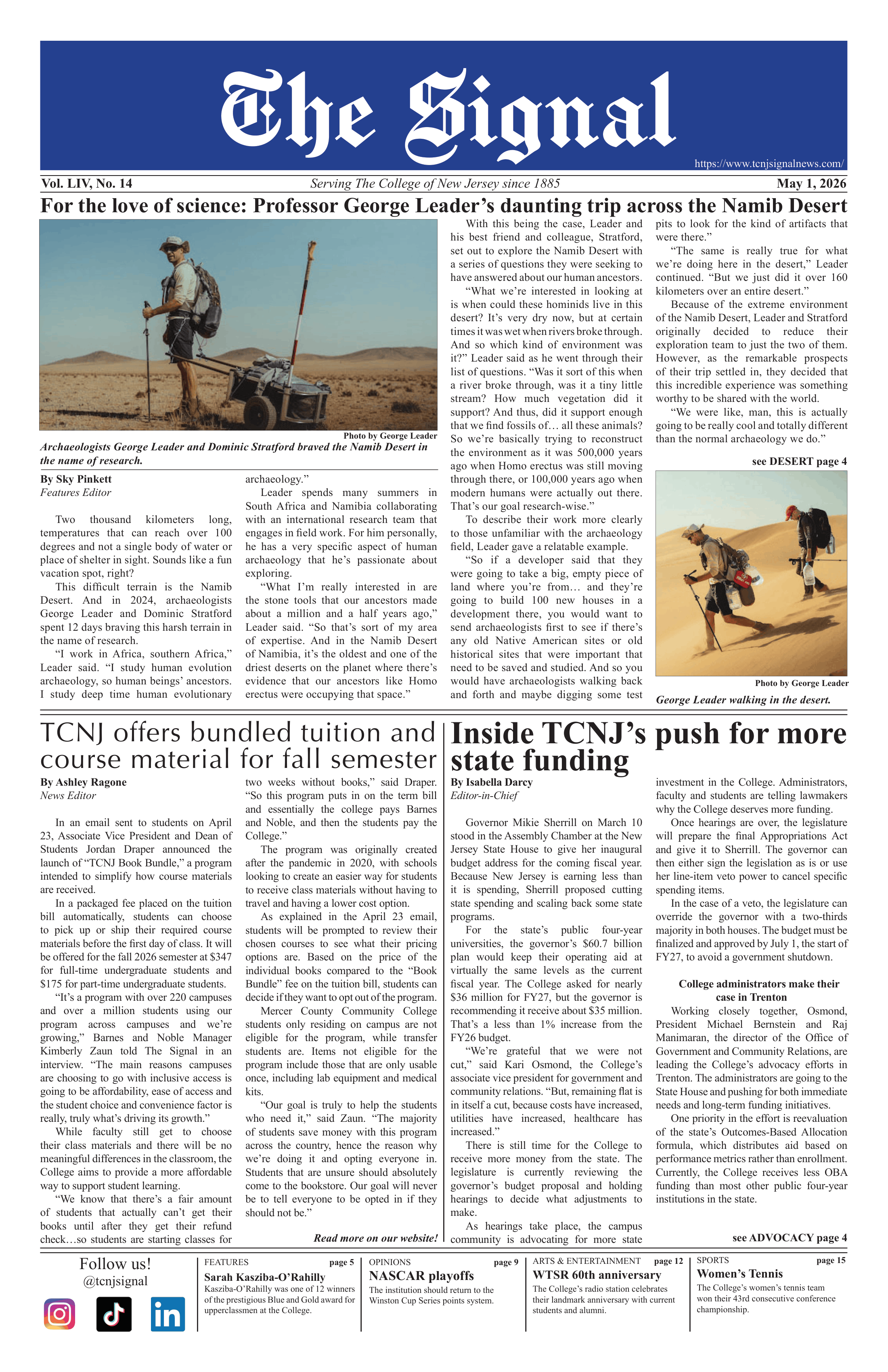
On Oct. 7, the ongoing collaboration of College and Community Relations (CCR), Information Technology (IT) and students of the College to revamp the school's Web site was revealed.
A main focus for CCR is keeping the College connected with its students, faculty, staff and outside surroundings and acting as a predominant outlet for such communication is through the College's homepage.
"(The maintenance of the Web site) is a 'live-being,' or ongoing process, in continuous evaluation, which we intend to update on an annual basis," Cindy Friedman, assistant director of CCR Marketing and Publications, said.
Much research went into the functionality, appearance, convenience, marketing and imagery of the College's homepage.
Over the summer 2005, seven students worked with CCR and IT to collect research questions, usability data and design recommendations.
"Categories and links on the old Web site seemed to be all over the place, with no real proper scheme," Derek Haas, senior computer science major and one of the Web application programmers for the project, said.
The team worked to create a more user-friendly system, employing the use of a portal system with landing pages for different users.
"Along with the homepage, we developed these pages to better suit the needs of these groups of people," Vinny Cerpa, senior business information systems major and information architect for the project, said.
According to Matthew Winkel, IT information architect, behind the homepage and admissions, the student homepage is the third most popular page on the Web site.
"My bookmarked TCNJ homepage is actually the 'Resources for Students' page, as it really has different, more focused content and better suits my needs as a student," Cerpa said, "It really has most everything a student is interested in from the homepage, and much more."
The redesigned homepage also allows for much more flexibility. The team found that the old Web site had limited space for delivering campus news and announcements, as well as highlighting campus beauty.
In the research and design phases, the homepages of other universities were used to determine how to make the College's homepage "as attractive as possible with functionality," Friedman said.
The homepage features a series of three rotating pictures displayed across the top: a campus image, followed by a people shot and a seasonal photo on the far right.
"It was a tricky task because it had to be coded to dynamically pull in a new set of random photos every time someone goes to the page," Rob LaPlaca, senior interactive multimedia major and Flash designer for the project, said.
The center image layers a campus photo with a fading image. "This is where we display our 'third-party endorsements,' or nice things said about us," Friedman said. "The fading aspect allows us to pat ourselves on the back without being showy."
The visual identity to the design also incorporates subtle branding, emphasizing name recognition through careful placement of both "The College of New Jersey" and "TCNJ."
However, "the real benefit to this Web site is its fairly consistent appearance in different browsers," Friedman said.
The degree of clarity on Web sites can vary within different screen resolutions and Web browsers, such as Internet Explorer, Firefox or Safari. For example, many browsers won't pick up the third image in the picture series.
"It was hard to make sure that the Web site looked correct in all different browsers," Scott Carpenter, senior computer science major and one of the Web application programmers for the project, said.
The team placed a strong focus on the liquidity of the Web site and designed it so the quality and sizes of images and text blocks are maintained in different screen resolutions. Unlike the old site, the size of this homepage can be shrunken without collapsing the design.
"I think the resulting home-page is much better looking, more usable and an overall better product than the previous homepage," LaPlaca said.